
Real world examples help students to see where the mathematics we teach them can be used. Let’s look at a real world example of a point of inflection.
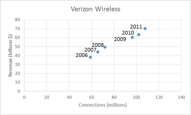
From 2006 through 2011, Verizon Wireless has grown steadily. The table below illustrates the growth in revenue as well as connections (phone numbers).

Let’s examine the relationship between connections and revenue by graphing them in a scatter plot. If the independent variable is the number of connection in millions and the dependent variable is the corresponding revenue in billions of dollars, we get the scatter plot below.
A cubic model for this data is

When we place the model on the scatter plot, we see that the model fits the data well.
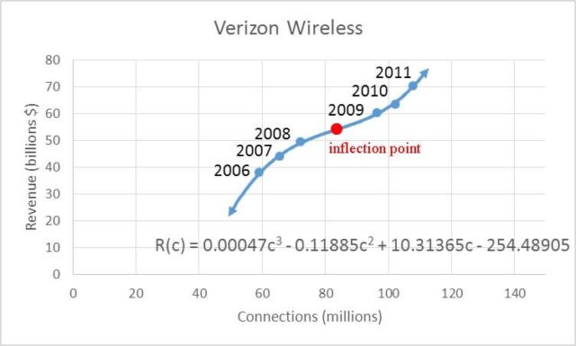
The cubic model has an inflection point. On the left side of the inflection point, the revenue is rising at a slower and slower rate. This means the slopes of tangent lines get smaller as they move from left to right near the inflection point. The graph is concave down on the left side of the inflection point.
On the right side of the inflection point, the graph increases faster and faster. In other words, the graph gets steeper and steeper. This results in the graph being concave up on the right side of the inflection point.
To locate the inflection point, we need to track the concavity of the function using a second derivative number line. Concavity may change anywhere the second derivative is zero. The first and second derivatives are

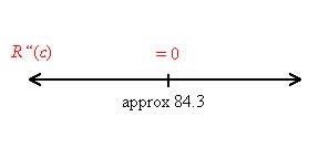
Set the second derivative equal to zero and solve for c:

Label this point on a second derivative number line.
Now test points on either side, at 50 and 100, to find the sign of the second derivative.

Label the number line with – and + to indicate the sign of the second derivative.
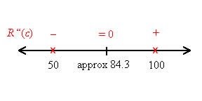
Now we can label the concavity on the number line.
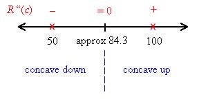
Since the concavity changes at approximately 84.3, it corresponds to an inflection point. Its position on the graph is found by substituting 84.3 into the original function.

This looks like it is in the right place on the graph.
On the left side of this point the function is concave down and on the right side it is concave up. Where the graph is concave down, the revenue increases as the number of connections increases. But the revenue increases at a slower and slower rate. When the graph is concave up, the revenue also increases but at a faster and faster rate.
Data like this are commonly found in corporate reports. Look at your stock portfolio or retirement fund…what are your largest holdings? Look through there latest annual report for interesting data. What happens to the sales as the amount spent on research increases? Many of my best examples come from these reports. The reports are a great source of data and help me to understand my investments better.


