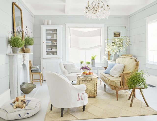
The living room is the place where we spend most of the time with our friends, family members, and other guests. It is said that this area is the one that reflects the whole home, and the style of the people who live there. Because of that, you need to arrange your living area furniture with taste, and whenever someone walks into the room, you can be proud of what you’ve done with space.
In this article, we are going to give you some tips on how to do that, and we will let you know more about the most common mistakes people make when designing this area.
1. What’s the focal point of the room?
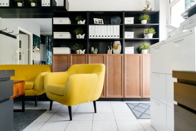
The first thing we are going to talk about is the focal point of the room or the main part of the space. It is said that you should have just one star of the show, and choose the other pieces so that they incorporate well in the place, without making it too crowded.
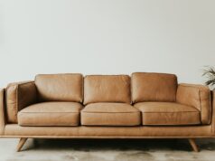
When it comes to the focal point, there are no rules here, and you can choose whatever you want as long as it represents your style and catches the eye of everyone who enters the living space. It can be a vintage piece from Chesterfield Sofa Company or a luxury piece from Fendi Home. You can choose anything from a bright and colorful sofa, up to a grand table, or you can just choose a coffee table that does not take too much space, but it is different and unique.
2. Let your space breathe
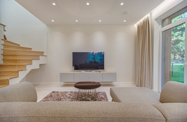
When we design our interior, we think that we should put everything together, and one of the worst mistakes people make is putting all of the furniture as close to the walls as possible. In some rare cases, this will create a good flow in the room, but more often than not, this practice is just going to make your space look smaller, and it will feel like everything is too crowded.
If you want to avoid this, the best thing you can do is leave at least 3 inches of space in between the walls and your items. In addition to making the space airy, you will also have less trouble cleaning all the parts of the area. It is said that if your space is bigger, then you should opt for leaving a few feet between the elements and the walls. Get creative, test several options out, and see which one works the best.
3. Furniture sets
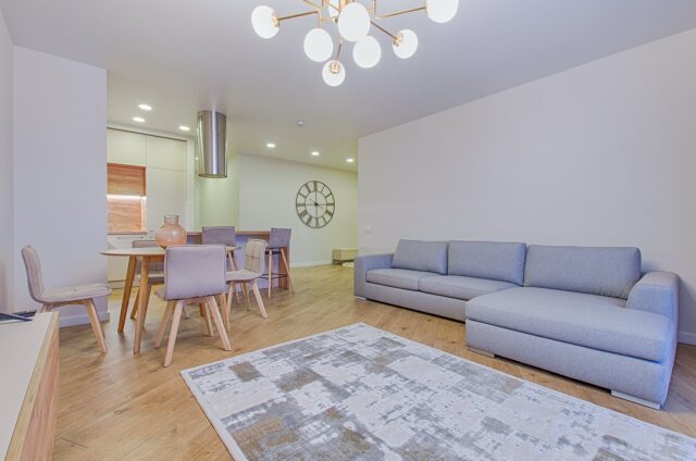
Now let’s talk about the exact elements that you are going to put in this area. Many people believe that you have to have every piece in a different color, or with a unique feature if you want to show your style. The reality is, one focal piece is more than enough, and if you overdo it, the place will not look good.
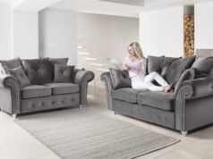
According to nyfurnitureoutlets.com, several pieces from the same set can make your room look luxurious, and you can also use them as the main point of the room. You can choose sets that come with two or more pieces, and you can choose any type of design or material you want. Nowadays, wooden elements are preferred, and you can combine them with leather or even metal.
4. Consider the flow

The next tip we have for you is always to consider the traffic and the room flow. To test things out, move around the space, go from one area to another, and see what you do. You can even put some props that will act like elements (for example empty boxes) and see if you can work your way around them.
You don’t want to put something in the way where people transition from one area to another, and you don’t want to have to jump over things or bump your legs on everything when you want to get up and go to the kitchen. Think about the routes you take when you go from the living space to the kitchen or hallway, and see what would be the most practical.
5. Size
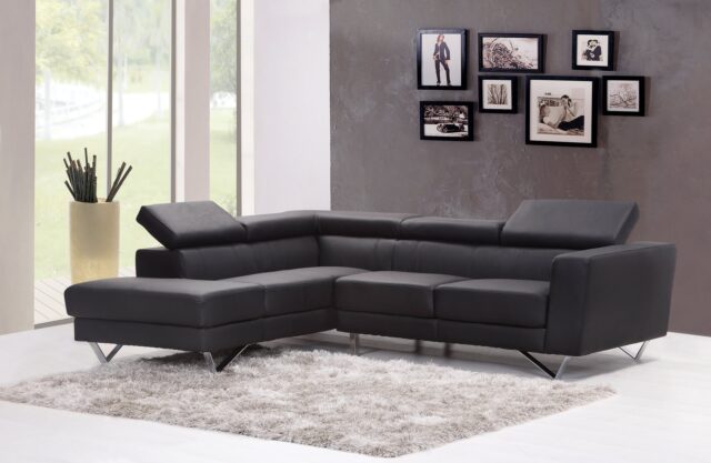
When it comes to size, you should try to find just the right balance. However, this all depends on the actual space. The rule of thumb is that you should not put too big or too small elements in a smaller space, because you don’t want to limit it and make it look crowded.
Choose things that are appropriate to the size of the actual area, and that will complement the space. Make sure you measure everything at least twice before you purchase it, and never make assumptions, or just hope that it will look fine. As we mentioned before, if needed, use props to see how things would look in the actual space.
6. Conversation space

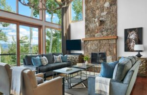
The last thing we are going to talk about is the conversation space. It is said that you should always arrange the elements so that you can create a space where people will be able to talk to each other without having to raise the voice to hear each other.
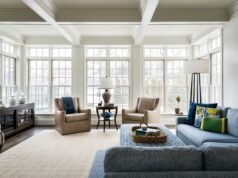
This means that you should position the pieces in a way that you can comfortably sit down, drink coffee, and talk to your family members and friends. If you want to make the space even cozier, then you should incorporate rugs.
Make sure all the elements are placed on the rugs or just one of them. For example, you can put a rug that showcases the conversation area, and place all the items there, or you can put a rug only under the coffee table. You are free to leave the floors bare or cover some parts with rugs, and leave the rest of the space bare.
These are some of the things that are going to help you create the best furniture arrangements in your living room. Always put the coffee table close enough to the sofa so that you can comfortably reach for the coffee or the snacks, but leave enough room so that your legs don’t bump into them. Everything is about the right size, so make sure you do your research about every piece you want to incorporate in the area.


