As the world of design progresses, so do the trends. In recent years, color trends have become increasingly valuable to digital and print designs. As such, they are a significant factor in how brands communicate with their audience and build recognition for themselves.
With this in mind, you’ll want to stay on top of what’s new and current to create designs that stand out from the pack. Here’s what Freepik anticipates will be trending in graphic design colors for 2025. We’ll also explain how you can use the beloved Pantone Color of the Year – Viva Magenta.
Why Color Matters in Graphic Design
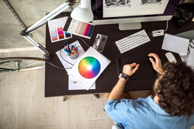
Graphic design colors are like storytellers; they speak to the viewer and evoke a certain emotion. They can be used as an accent or as the leading graphic design inspo for an entire design.
Color theory is key when selecting graphic design colors for projects because each color has its own meaning and connotation. By understanding color theory, designers can create visually appealing compositions that resonate with the target audience.
The way a designer uses colors will set the mood of the design and give it its unique personality.
Colors also help to guide people’s eyes where you want them to go when they look at your work, making sure all the important parts stand out.
Without further ado, let’s dive into the four graphic design colors of 2025.
Bright Neons
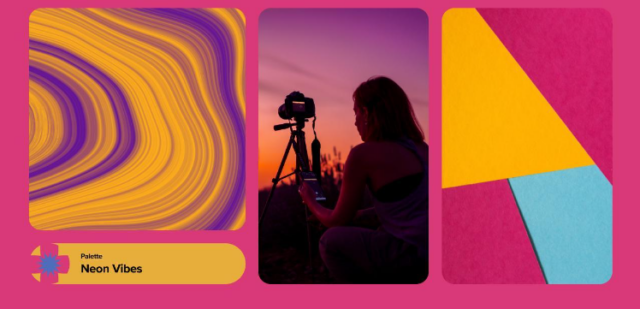
Neon is becoming increasingly popular in graphic design to express fantasy and escapism. Designers and brands use this colorful look to capture the crowd’s attention.
This palette is a fantastic design trend for 2025 and the perfect inspiration for designing logos, used as background color to make any design stand out, creating illustrations, and social media graphics.
The neon trend is especially prevalent among generation Z, who are drawn to its bold and playful look. With their bright colors, neons can be used to create a fun and futuristic atmosphere.
Neon also provides a fun way for graphic designers to express themselves artistically while ensuring that the message they’re trying to convey is clear. It can also be used to emphasize a brand’s energy and create an upbeat vibe that encourages people to explore and take risks.
Natural Green
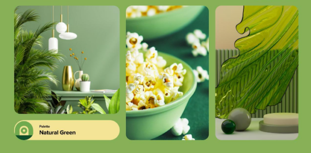
Natural green is the perfect way to capture moments of peace and relaxation. This trend is about bringing nature into your design through raw materials or plants or by creating an overall calming atmosphere with muted greens. It also aims to develop a sense of harmony between nature and technology or urban life to create a more balanced lifestyle.
Designers are using natural green tones for everything from websites for wellness brands, logos for sustainability-focused companies, and packaging for eco-friendly products.
Brands can use natural green tones to emphasize sustainability efforts and create a tranquil atmosphere that encourages people to relax and rejuvenate. Brands like Patagonia and Lush have all embraced this trend in their design work.
Soft Pastels
Soft pastels are having a major moment regarding graphic design colors. We see soft pastel tones used to create dreamy landscapes, romantic settings, and moments of tranquility. This trend is about creating images, designs, and illustrations that evoke nostalgia and comfort.
This trend is perfect for branding projects as it allows companies to create an overall feeling of warmth and familiarity with their customers. Soft pastel shades can also emphasize the delicate nature of a product or service and create a sense of trust with potential buyers.
Sunset Hues
Sunset hues are one of those color trends that will continue to be popular into 2025. This trend is characterized by vibrant oranges, pinks, and reds combined with softer tones like blues and purples.
Sunset hues can also be used to add an element of playfulness or whimsy to a design project. The idea is to create images that evoke warmth, peace, and joy.
Brands are embracing this trend in their designs, allowing them to show off their creative side and convey a sense of freedom.
Pantone Color of The Year – Viva Magenta
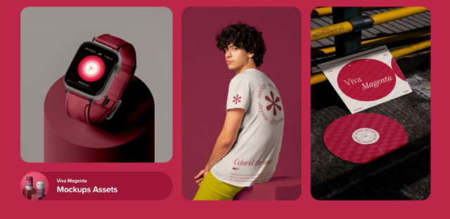
Welcome to the Magentaverse! The Pantone Color of the Year for 2025 is Viva Magenta, a vibrant and uplifting hue that adds energy and life to your design work. It’s a “brave and fearless red shade” that symbolizes the brave new beginnings of the digital world.
The boldness of Viva Magenta can be used in digital assets like icons, graphics, mockups, and print materials such as posters and flyers.
Viva Magenta’s bright vibrancy adds excitement and joy to any project.
It works well with other colors, such as white, black, and gray, for an edgier look, or blues and greens to create a more natural feel. Brands can use Viva Magenta in their designs to capture youthfulness and modernity.
You can also incorporate Viva Magenta into your website design as an accent color or background pattern. Or, you could use it to create an eye-catching logo or header image. The possibilities are endless with this vibrant hue!
By adding a touch of this color to your digital assets, you can create a fun and inviting atmosphere that will draw people in.
Conclusion
Color trends in 2025 are all about finding the perfect balance between reality and fantasy, natural greens to bring a sense of harmony and relaxation, soft pastels to evoke a feeling of nostalgia, and sunset hues for an element of playfulness. With these four graphic design colors in mind, we can create beautiful designs that capture the essence of the moment and unique visuals that stand out in the digital world!

